CF Toronto Eaton Centre
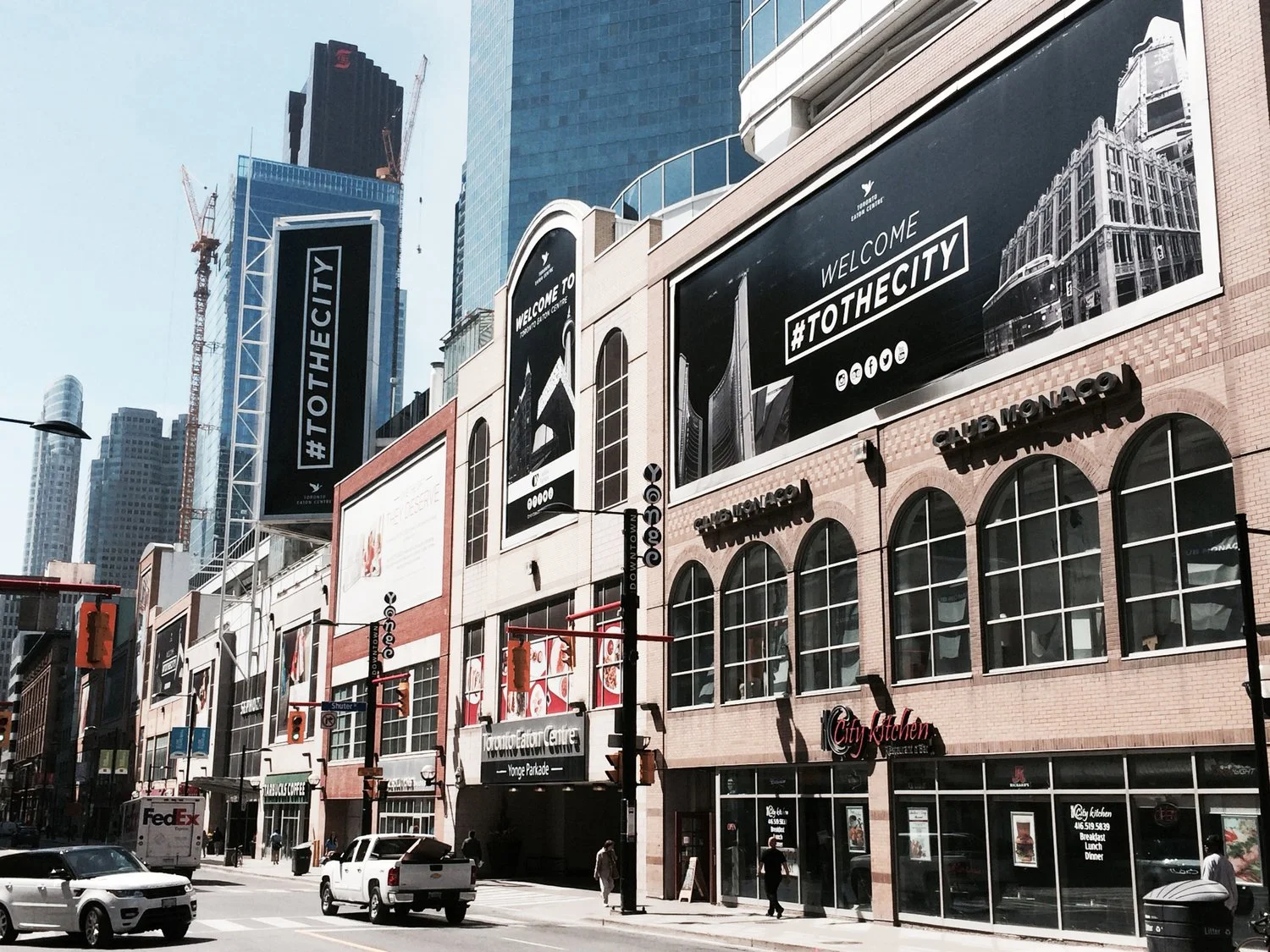
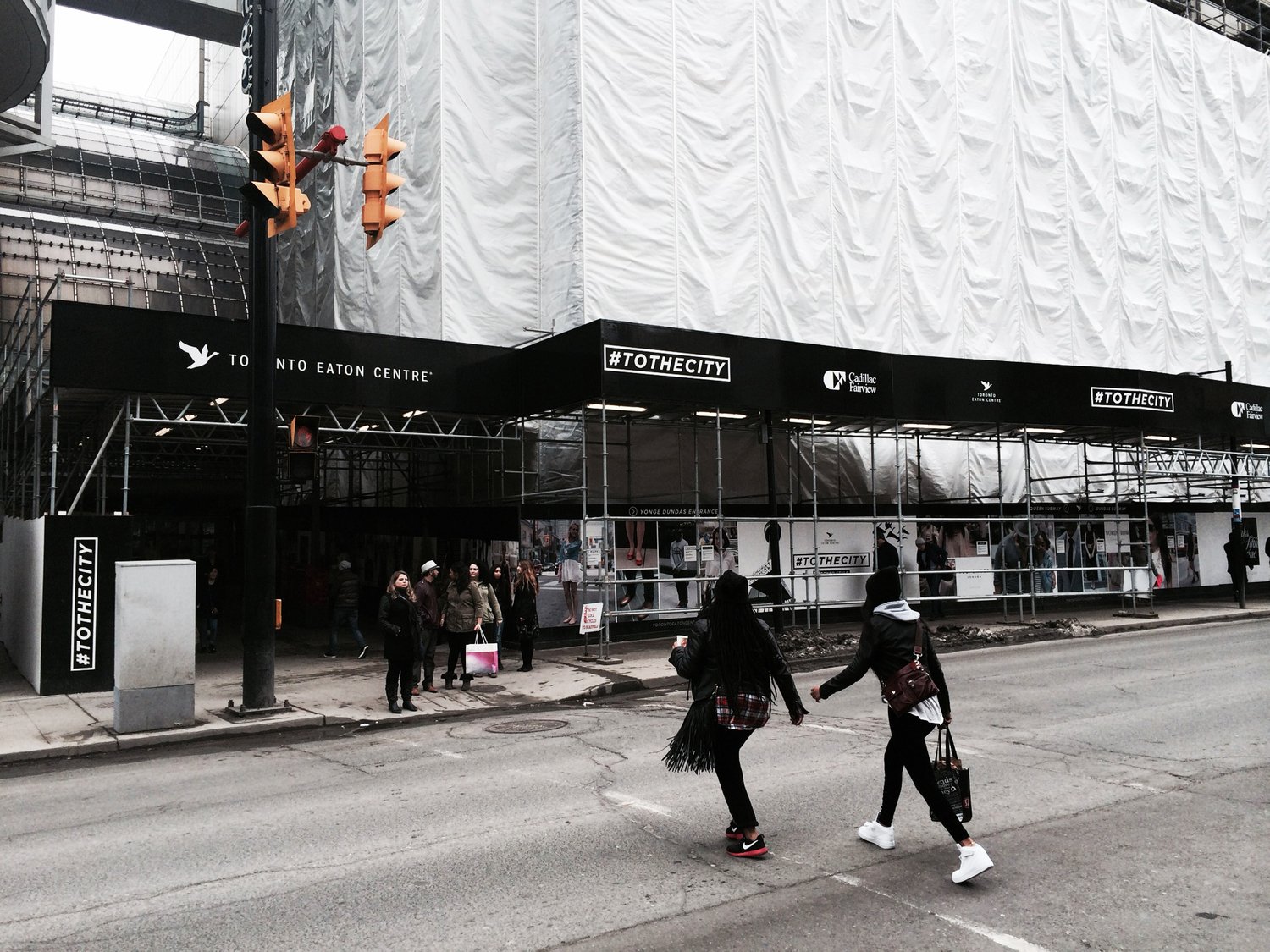
The first phase of rebranding Eaton Centre was finding out what it means to people. They see it as a cultural landmark and associate it with downtown. Reflecting the style of the city with bright splashes of colour and collages of Toronto's iconic landmarks, the new identity reflects the vibrant energy of downtown. Taking advantage of ample wall space from construction hoarding, #ToTheCity was a campaign hashtag, helping anchor the rebrand.
A second wave of the campaign took street style images, used across the social channels as well as blowing them up to oversized prints. Street style was brought, to the streets, where visitors could see themselves as a part of the campaign.
Agency: TCP
Copywriting: Page 7
Photography: Dave Gillespie
Scope of work
Art direction
Collage art
Graphic design